Ica Kvantum Boden
It was an incredible journey to work with such a beloved brand as ICA Kvantum Köket, and truly an honor to contribute my creativity to their identity.
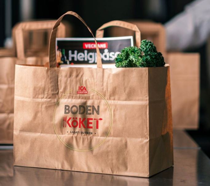
My inspiration came from the love and care that ICA Kvantum Köket puts into every meal and every customer experience. The color choices blend ICA’s existing visual identity with a touch of gold in small details, evoking thoughts of fresh, high-quality ingredients. The typography is modern and easy to read, reflecting ICA Kvantum Köket’s professional and inclusive approach—showing that ICA is a store for everyone, regardless of ability.
I’m very grateful for the trust and creative freedom I was given during the design process. Seeing the logo now in use on ICA Kvantum Köket’s signs, packaging, and marketing materials brings a true sense of pride and fulfillment.
Thank you, ICA Kvantum Köket, for this fantastic collaboration and for allowing me to be part of creating your new visual identity!
Key Takeaways: Working with an existing, well-known brand and carefully following their design guidelines was a valuable experience. This was also my first logo design that would be printed, including as stickers and on paper bags. Ensuring the design would work and remain recognizable at such a small scale was challenging, but I succeeded! This project also allowed me to deepen my skills in Adobe Illustrator.


